Identity Programs/Branding
I have worked on many logos, icons and corporate branding projects and these are amongst my favourites. They all have a story and some of these involved very large projects like the Knighthawk GoAir Express branding project which included aircraft paint design and everything that went into launching a new passenger airline. Others of these represent much smaller projects but they all involved unique experiences that made the projects very interesting.
Harmonic Wave Logo
This logo was designed for guitarist Bob Mann who played with Linda Ronstadt, James Taylor and many other artists. It was done quite a few years ago but I still like it. The name of his company at the time was 'Harmonic Wave.'
Inviro logo
Inviro Engineering Systems is an engineering firm that works primarily with large scale businesses. They specialize in mechanical engineering systems with an ecological focus. Their logo was developed with their past in mind as well as their future. There were components of the past redeveloped and simplified so that their brand was still recognizable but revitalized.
The new logo represents a new thrust into the areas of engineering that Inviro both wants to explore and has been working on already. Their current work has gone beyond their old image so the brand had to reflect their new direction.

Cahill Energy Logo
This logo was developed for an energy company based in the UK that is specializing in the development of plasma gasification plants. These plants use a technology that converts 'garbage' at extreme heat into synthetic gas and other usable substances with little or no toxic waste dumped into the environment.
Wildlife Niche Logo
This logo was designed for a store several years ago. I liked the general idea and the positive and negative intersection of concepts.
Prime Times Strategies Inc Logo
This consultancy gives strategic marketing advice and advocacy support to non-profit organizations in the Greater Toronto Area and beyond.
Plastic Parameters Logo
When Plastic Parameters decided re-brand their company we designed a logo that reflects what they do, which is to manufacture coffee display and merchandising products for coffee shops and grocery stores. Their previous logo did not have an clear reference to coffee so we chose the obvious beans. The brackets imply the parameter aspect of their name and the rounded letter forms suggest the plastic nature of their primary building material. We thought it best to be obvious since their business name doesn't make their primary business as obvious as it should be without reference to the coffee industry.
KnightHawk Inc. Logo
KnightHawk Inc. is a transportation company featuring aviation and rail transport components and this design was an update to their existing logo. They wished to retain the text part of the logo and modernize the hawk. The resulting logo was used on all their aircraft and trains.
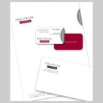
Political Capitol Logo and stationery
This project was designed for a Washington D.C. based 'image' coach who advises shy or inept politicians. I don't know if I've ever met any shy politicians... but the inept ones.... All I can say is that I'm sure she's very busy.
IAPA-IMS program logo
This logo was designed for a program for sale within the Industrial Accident Prevention Association (IAPA) that was particularly difficult to promote since it was a concept product more than an 'physical' product. It was way of thinking about safety and the shape of the logo reflected the shape of the graphic that explained the concept to the IAPA clients.

Access Denied Systems logo
This was a re-branding project that was done to update the company's old logo that had been in use for many years. We retained the colour approach used for the original design but that was the only reference to the past.
Luciboo Logo-Graphic element
This illustration was used as the new logo and as a graphic element for the Luciboo website which is a children's web portal. The illustration was programmed so that the eyes would follow the cursor around on the web page and add another layer of fun to the child's experience. The site was developed by The Children's Technology Workshop.
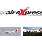
GoAir Express Logo
This logo was designed for GoAir Express, a subsidiary of KnightHawk Inc, a transportation company. It had to apply to the aircraft and to all other corporate collateral including signage, brochures, and schedules.
Castelo Logos
The Castelo is a unique property in Brazil that features a former monastery that will be converted into a five star hotel and eco-tourism site since the grounds are part of the largest urban rain forest in the world. The logo was created using a detail from the wrought iron front gate and the two logo variations were used for different applications.

