Corporate Communications
This section of the site contains a few examples of corporate communication projects. New assignments will be added on a regular basis.

Alzheimer Society of Canada Annual Report 10-11
This Annual Report was based on the ideas of Hope, Courage and Progress and focused on the encouraging progress in the fight against various forms of dementia.

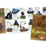
Levi-Strauss internal communication poster
This project was done through Edwards & Company, who did corporate events and communications. It was an internal Levi Strauss poster that was used to generate excitement within the company about a move to a new and much larger location.
Creative collaborator: Lyn Edwards, Edwards & Company
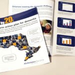
Alzheimer Society of Ontario - 10 by 20 Report.
A report highlighting the number of people that would be afflicted with dementia of various types in Ontario by 2020
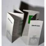
Steelcase Canada Environment Brochure
Steelcase Canada brochure highlighting the strides that the company was taking environmentally to benefit the world.
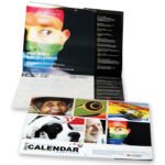
Diversity at Work Calendar 2013
This is a 32 page Calendar that is done on a yearly basis that is focused on the theme of 'Diversity in the Workplace.' This very high quality project contains hundreds of holidays and significant dates from around the world that are meant to increase awareness of the diversity of Canadian culture.
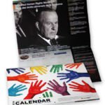
Diversity at Work Calendar 2014
The project also included producing graphic elements for an online calendar and promotional graphics.
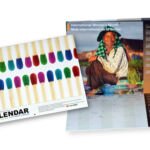
Diversity at Work Calendar 2015
The format and the web graphics that accompany this publication are similar to the previous editions.
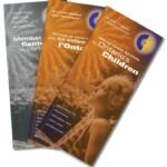
Brochures for Children's Mental Health Ontario
These brochures were overview documents that promoted the cause of Children's Mental Health Ontario. They were done in English and French and included a separate black and white directory of children's treatment centres all over Ontario
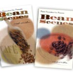
Plastic Parameters Bean Scenes Brochures
These smaller sized brochures were made with mailing costs in mind and they were created to feature a focused group of coffee display products that were the company's most popular. They were also meant to be handed out at trade shows where they would replace the more expensive promotion package and give potential clients a preliminary taste of what the products were all about.

Canadian Rehabilitation Institute (CRI) brochure
There is a strong tendency for people in the rehabilitation profession to feature damaged body parts or body parts in the midst of repair in their promotions so we decided to represent the results of successful rehabilitation: beautiful and healthy parts of the body.
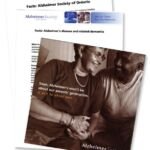
Alzheimer Society of Ontario-Fundraising Kit Items
These items were included in a pre-existing fundraising kit so the style had to be attuned to the original kit design. They were made to enhance but not compete with the original kit concept
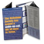
Alzheimer Society of Ontario-Annual Report-09-10
In 2009 we re-designed the format of the Annual Report to be smaller but with a fold out section at the front and back to contain information that required more space.
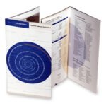
Alzheimer Society of Ontario-Annual Report-10-11
We continued with the same format in 2010-11. This image shows the French cover page and some English inside pages.
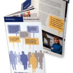
Alzheimer Society of Ontario-Annual Report-11-12
This Annual Report was the same format but featured a very different theme that carried on throughout the year: 'The conversation is changing.'
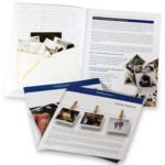
Alzheimer Society of Ontario-Will Planner
This project is part of the Alzheimer Society's Planned Giving program which helps people to plan their wills.
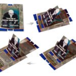
Worldcom / UUnet Trade Show Invitation
This was a collaborative project with Myriad Marketing, an advertising agency. Worldcom had just purchased UUNet and this was an invitation to a trade show booth where the new merger would be celebrated
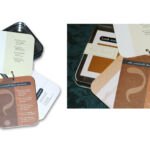
Promotion piece for Edwards and Company
This promotion piece included a set of cards designed to fit into a box that the client sourced at an incentive products supplier. The cards highlighted the Edwards and Company services which involved event planning for corporate clients. The boxes were hand delivered to potential and existing clients.
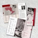
OACRS Mini Report 2004-5
This was a miniature Annual Report that was just meant to communicate the facts in a very cost effective way to an in-house audience. Subsequent Reports became more comprehensive since they came to be used as promotion vehicles to tell the organization's story to the general public and potential donors in addition to being documents for communicating salient facts about the organization to stakeholders.
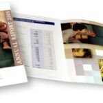
OACRS Annual Report 2005
This annual report for the non-profit organization, Ontario Association of Children's Rehabilitation Services (OACRS), was one of a design format series that was meant to communicate the work of the organization, their financial position and also acted as a promotion vehicle. We kept the format the same for three years since the costs of production were predictable but it still afforded us a very useful document.
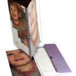
OACRS Annual Report 2006
This report was done for the Ontario Association of Children's Rehabilitation Services (OACRS) and was part of a strategy to use their annual report as promotion device for the organization which serves severely disabled children as an interface between children's treatment centres all over Ontario and government agencies.

OACRS Annual Report 07-08
This was another Annual Report for OACRS based on the same format established for previous publications.
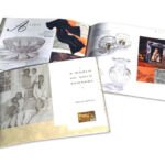
CIBC Goldcard Catalogue
This catalogue was designed for CIBC Gold Card as part of the Hudson's Bay Loyalty Management Group which handled the Club Z points programs. Creative Edge designed the catalogue and art directed the product photography which was done by Kathryn Hollinrake Photography. The project also involved extensive Photoshop work and propping of the products during 3 weeks of full day photo sessions.

Parents for Children's Mental Health Brochures
These brochures were focused on a difficult social problem that is not easily discussed: children's mental health. The sad fact that there are many children with mental health problems is often obscured by behavioural problems being relegated to the school or legal systems when children are involved with anti social activities or suicide. The brochures were meant to draw attention to the issue, primarily for parents and teachers, without creating a social stigma for the children involved and offer ways for them to find help.
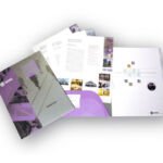
Inviro Engineered Systems Brochure
Corporate brochure and inserts for an engineering firm, Inviro Engineered Systems Ltd. The format allows for a flexible approach to the number and type of descriptive insertions which detail the different services offered by the company. The basic folder contains a stitched in 'generic' description section that introduces the company, and a place to put an introductory letter and business card.
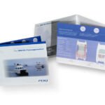
PDQ Yachts brochure
This project was a feature brochure for the PDQ MV/34 Passagemaker which was one of two brochures produced for PDQ yachts. Both projects involved detailed schematic diagrams of the boats and emphasized the yachting lifestyle for potential owners.
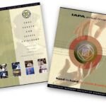
IAPA Annual Report and Catalogue
These were extensive documents that involved a lot of information from different aspects of the IAPA's operations. The catalogue highlighted all of their programs and products and the Annual Report described the nature of their operations, acted as a promotion piece and and provided their financial information.
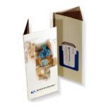
Riverfront Medical Services-Mini brochure
Riverfront Medical Services needed a mini brochure that would act as a smaller, simpler synopsis of their services that could be left behind with new prospects. This was not meant to replace their much more detailed pocket folder which was offered when a new client was officially 'signed up'. The folder also features business card slits and is small enough to be mailed in a standard # 10 envelope.
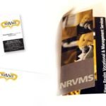
NRVMS brochure and stationery
NRVMS is a management company working in the healthcare industry that relies on many freelance professionals to expedite their services.
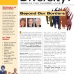
Diversity! - Newsletter
The Diversity! newsletter was a targeted online PDF publication that also could double as a printed piece. The rainbow effect in the publication banner which also acted as a logo represented the theme of diversity in the workplace and the publication was extended for the most part to large corporations for whom diversity in the workplace was an urgent issue. Later on the publication was morphed into a web site.

